Mastering the Art of Excel Waterfall Charts: A Dazzling Display of Data
Excel Waterfall Charts are not just another tool in your spreadsheet arsenal. They’re your secret weapon for making data come alive, telling a compelling story of change and progress across time. But let’s face it, the default settings can be, well, a bit bland. To truly make your data dance, it’s all about color customization. This is where the magic happens, transforming a simple chart into a masterpiece of insights.
Revamping Your Excel Waterfall Chart with Colors
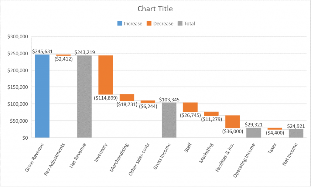
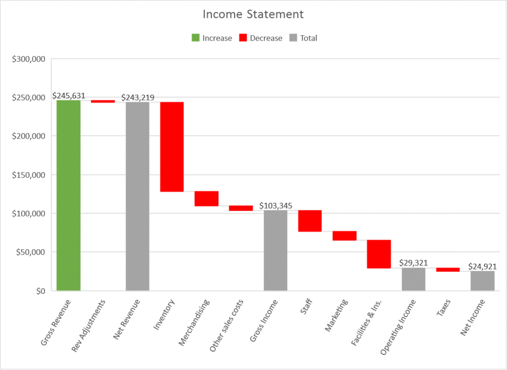
Customizing the colors of your Excel Waterfall Chart can dramatically enhance its visual impact. Picture this: Instead of a monotonous blend of greys and blues, your chart bursts with color, each shade guiding the viewer through the highs and lows of your data story.
Here’s how to paint your chart with the colors of clarity and impact:
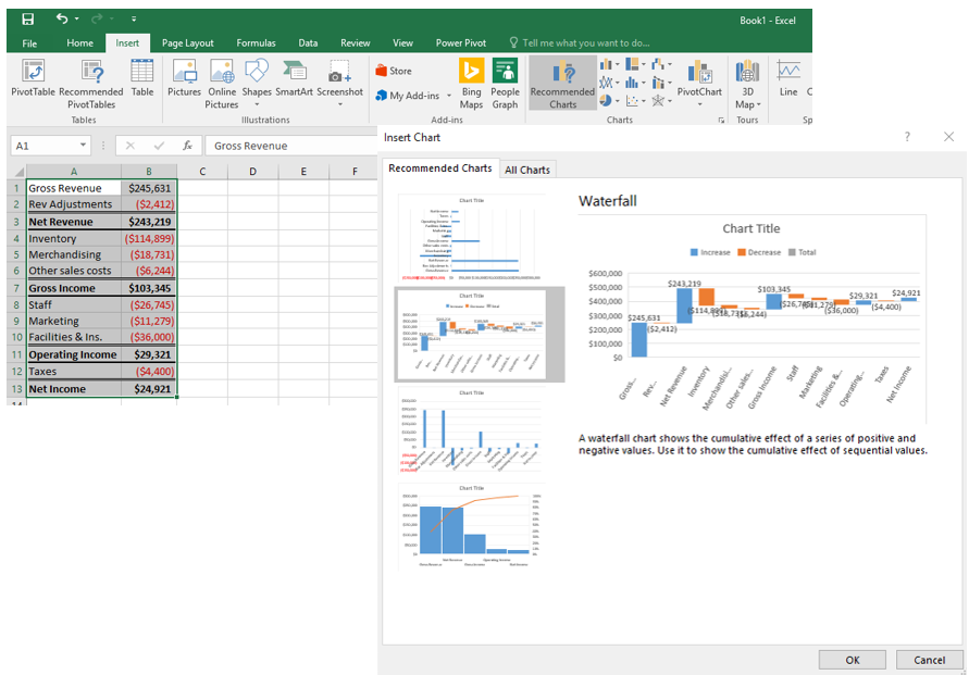
- Fire up Excel and choose the data destined for stardom.
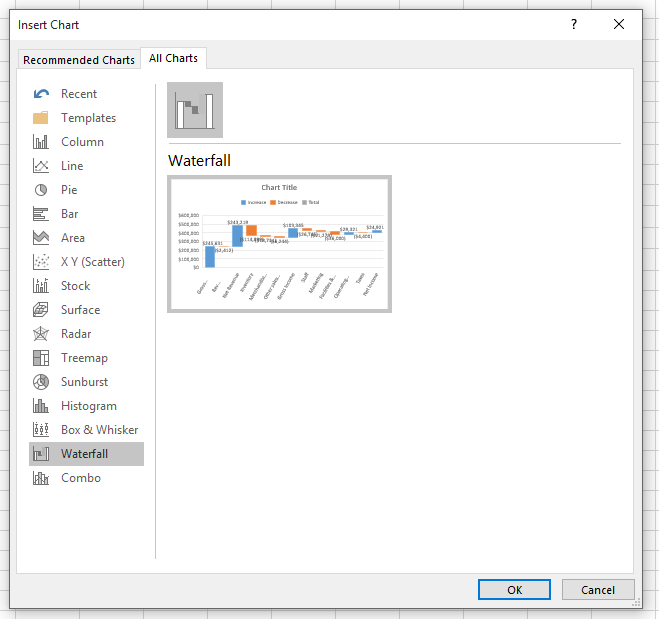
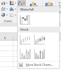
- Head to the “Insert” tab, select “Waterfall” from the “Charts” section, and watch your basic chart spring to life.
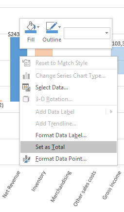
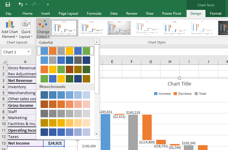
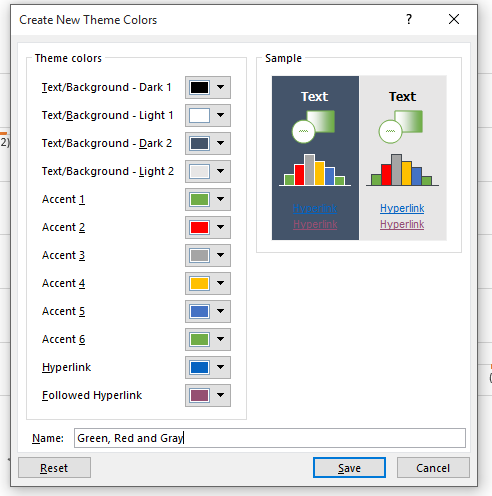
- Right-click on that newly minted chart and hit “Format Data Series”. This is your gateway to color customization.
- Dive into the “Fill & Line” tab, flirt with the “Fill” drop-down menu, and there you have it – a kaleidoscope of colors at your fingertips. Choose wisely, my friend.
With just a few clicks, you can make your chart not just informative but visually compelling, a beacon of insight in a sea of data.
Why Color-Coding Your Chart is a Brilliant Move
It’s All About Understanding
Color-coding isn’t just about aesthetics; it’s a beacon of understanding in the complex world of data. Assigning specific colors to positive, negative, and neutral values makes your chart a quick read. Imagine glancing at a chart and immediately spotting trends and insights, thanks to a thoughtful splash of colors. It’s like having a data story unfold before your very eyes.
Drawing in the Viewer
A well-designed, colorful chart isn’t just informative; it’s magnetic. It draws the viewer in, encouraging a closer look and deeper understanding. In the world of presentations and reports, capturing and holding attention is half the battle won.
Accessibility Matters
Consideration for color choices can also make your data accessible to everyone, including those with visual impairments. By using color thoughtfully, you make sure your insights don’t miss any eyes.
Choosing the Perfect Palette
Choosing colors for your Excel Waterfall Chart is an art in itself. Here are some guidelines to ensure your chart is both beautiful and functional:
- Contrast is Key: Opt for colors that stand out against each other, making each data point distinct and easy to follow.
- Context Matters: Align colors with the nature of the data (e.g., green for profits, red for losses).
- Keep it Simple: A palette limited to a few colors avoids visual chaos, making your chart more approachable.
- Stay On-Brand: If your chart is part of a larger presentation or report, ensure the colors align with brand guidelines, creating a cohesive visual experience.
- Data-Driven Decisions: Use colors to emphasize the story your data is telling. Differentiate positive from negative values or highlight significant data points.
Creative Color Strategies
Now that you’re armed with the basics, let’s dive into some creative techniques to elevate your Excel Waterfall Chart:
- Gradient Magic: Use gradients to indicate the magnitude of change—subtle shifts from light to dark can illustrate the scale of impact.
- Highlight the Milestones: Use standout colors to mark the beginning, end, or critical turning points in your data story.
- Categorize with Color: Group similar items or phases with color coding, making complex data sets easier to navigate at a glance.
- Signal the Significant: A sudden spike or drop? Highlight these with striking colors to ensure they command attention.
Best Practices for a Stellar Waterfall Chart
To wrap up, here are golden rules to adhere to when customizing your Excel Waterfall Chart:
- Start Smart: Templates can be a great starting point, ensuring your chart is on the path to visual excellence from the get-go.
- Highlight Wisely: Use color to spotlight the key takeaways, guiding your audience’s gaze to what matters most.
- Group for Clarity: Color groupings can untangle complex data, making your chart a clear, concise narrative.
- Reveal Trends: Utilize shades to unveil trends, making upward or downward trajectories instantly recognizable.
- Facilitate Comparisons: Allow viewers to make quick comparisons by employing color differences to signify variance in values.
- Illuminate Relationships: Shed light on how different data points interact or contrast, using color as your guide.
Embracing these tips and tricks will transform your Excel Waterfall Chart into not just a display of data, but a storytelling spectacle. It’s time to let color be your guide on this journey, turning numbers and charts into narratives that captivate and inform. Let your chart be more than a mere visual; make it a vibrant vehicle for insights, trends, and stories waiting to be told. Happy charting!
Color isn’t just a matter of aesthetics; it’s a powerful tool that can significantly affect the perception of your data. Understanding the psychology behind color choices can be a game-changer for presenting your Excel Waterfall Chart. Let’s delve into how specific colors can influence your audience’s reaction to the data being presented.
Choose Wisely, Persuade Subtly
- Green’s Growth Story: Universally, green is associated with growth and success. Use it to highlight positive increments or financial gains, reinforcing the idea of prosperity.
- Red Alerts: The color red grabs attention and often signals caution or negative trends. It’s excellent for illustrating declines or losses, prompting viewers to take note.
- Blue’s Calm Confidence: Blue conveys reliability and trust. Utilizing shades of blue for stable or neutral data points can instill a sense of confidence in the data’s integrity.
- Yellow’s Optimism: Use yellow to spotlight areas of opportunity. Its brightness evokes a sense of optimism and can draw attention to key takeaways.
Navigating these color cues can elevate your Excel Waterfall Chart from merely informative to subtly persuasive, steering your audience’s emotions and interpretations in a subtle yet profound way.


Mastering the Art of Accessibility in Color Design
In an age where inclusivity cannot be overstated, ensuring your Excel Waterfall Chart is accessible to all, including those with color vision deficiencies, is crucial. Here’s how you can create a chart that’s as inclusive as it is informative.
Beyond Color: Clarity for Everyone
- Contrast is Crucial: High contrast between colors ensures that even those with color vision deficiencies can distinguish different elements of the chart.
- Texture Tells a Tale Too: Incorporating patterns or textures alongside color can help distinguish between data points without relying solely on color.
- Consistent Cues: Using consistent color schemes across charts can help users learn and remember what each color signifies, enhancing understanding over time.
- Tool-Assisted Testing: Leverage tools designed to simulate various forms of color vision deficiencies, ensuring your chart remains effective under different viewing conditions.
By adopting these practices, you make your Excel Waterfall Chart not just a beacon of insight but also a model of accessibility, ensuring that every viewer can fully appreciate the data you present.
Leveraging Color to Forecast Trends and Projections
Your Excel Waterfall Chart isn’t just a record of what’s happened; it’s a canvas for projecting future trends. With color, you can add a layer of predictive analysis that makes your chart a forward-looking tool. Here’s how colors can transform your chart into a visionary piece of analysis.
Futuristic Shades for Forward Thinking
- Highlight Predictions: Use a distinct color to differentiate projected data from historical data. This distinction clarifies where fact meets forecast.
- Cue for Caution: Utilize color gradients to indicate the level of confidence in future projections, with more vibrant colors representing higher certainty.
- Timeline Transitions: Employ color shifts to visually represent the movement through time, from past performance to future expectations. This visual guide aids in understanding how past trends might influence future outcomes.
Incorporating these strategies turns your chart into a narrative of not just where you’ve been, but where you’re headed, inviting viewers on a journey from past performance to future potentials.
Effective Communication Through Color-Coded Commentary
A picture may be worth a thousand words, but a well-crafted Excel Waterfall Chart, enriched with color-coded commentary, can tell a complete story. Here’s how to use color to add insightful commentary directly within your chart.
Colors That Communicate
- Annotation with Appeal: Use text boxes or annotations in contrasting colors to highlight and explain significant data points or trends. This bridges the gap between raw data and insightful commentary.
- Legend by Design: A color-coded legend, especially one with symbols or patterns, can serve as a quick reference, making your chart instantly more navigable.
- Strategic Emphasis: Emphasize strategic insights by assigning a unique color or effect (like glow or shadow) to the text that discusses future strategies or recommendations. This visual prioritization ensures that your strategic insights stand out.
By effectively integrating color-coded commentary, your Excel Waterfall Chart transitions from a static presentation of data to an engaging, narrative-driven exploration of insights and strategies, offering a richer, more compelling story.
Conclusion: The Symphony of Colors in Data Visualization
Transforming your Excel Waterfall Chart with a thoughtful application of colors elevates it beyond a mere analytical tool. It becomes a compelling narrative, a canvas that speaks volumes through its hues and shades. Whether it’s guiding the viewer’s emotions with psychology, ensuring inclusivity through accessibility, projecting future trends, or enriching the narrative with color-coded commentary, the strategic use of color can turn your chart into a deeply impactful visualization.
Embrace these principles, and let your Excel Waterfall Chart be not just seen, but truly understood, appreciated, and remembered. Through the symphony of colors, make your data not just present but powerfully resonate with every viewer.
Frequently Asked Questions (FAQ)
1. What is an Excel Waterfall Chart?
An Excel Waterfall Chart is a type of graph that visualizes the sequential change in values over time or categories. It’s particularly useful for understanding how an initial value is affected by subsequent positive and negative changes.
2. How do I access templates for Excel Waterfall Charts?
Templates for Excel Waterfall Charts can be accessed within Microsoft Excel by navigating to the “File” menu, selecting “New,” and searching for “Waterfall Chart” in the template search bar. Additionally, templates can be found on the Microsoft Office website or through third-party sites offering Excel templates.
3. Can I customize the color scheme of an Excel Waterfall Chart?
Yes, you can customize the color scheme of an Excel Waterfall Chart. This can be done by right-clicking on the elements of the chart you wish to customize, selecting “Format Data Series,” and then choosing new colors under the “Fill” option.
4. How can I make my Excel Waterfall Chart accessible to those with color vision deficiencies?
To make your Excel Waterfall Chart accessible, consider using high-contrast colors, adding textures or patterns to different sections of the chart, and ensuring that information isn’t conveyed by color alone. Tools like Microsoft’s Accessibility Checker can also help identify and resolve accessibility issues.
5. How do I use color to highlight trends or forecasts in a Waterfall Chart?
To highlight trends or forecasts in a Waterfall Chart, use distinct colors or gradients to differentiate between past performance and future projections. This visual distinction helps viewers easily differentiate between actual data and forecasts.
References and Citations
To further explore the concepts and best practices discussed, the following external links and academic sources are recommended:
- Microsoft Office Support – Waterfall Charts in Office. This page provides an overview and guide on how to create basic to advanced Waterfall Charts using Microsoft Office tools. Microsoft Office Support
- Tufte, Edward R. (2001). The Visual Display of Quantitative Information. Graphics Press. This seminal book provides foundational concepts in information design and the visual display of data, relevant to creating effective Waterfall Charts.
- Few, Stephen (2006). Information Dashboard Design: Displaying Data for At-a-Glance Monitoring. Analytics Press. Few’s work, while focusing on dashboards, offers valuable insights on how color and design influence data comprehension, applicable to Waterfall Charts.
- Meyer, Jonathan (2020). Data Visualization: A Practical Introduction. Princeton University Press. Meyer’s book includes concepts on effective visualization techniques, including the use of color to enhance understanding and communication of data.
- Color Universal Design (CUD) – Guidelines for Color Accessibility. This resource offers guidelines and tools for selecting color palettes that are accessible to those with various types of color vision deficiency. Color Universal Design (CUD)
These sources offer a mix of practical guidance and foundational theory relevant to enhancing Excel Waterfall Charts through color customization and effective design principles.

